Welcome to HDBSCAN spike sorter’s documentation!
Spike sorting is the act of discriminating action potential from different sources (i.e from different neurons) in one’s data. The data can be one dimensional or multi-dimensional, for example when multi-electrode arrays are being used. This spike sorter has been designed to handle one dimensional data.
This spike sorter was developed by David Tadres while working in Matthieu Louis’ laboratory at UCSB to analzye electrophysiology data for the manuscript titled “Depolarization block in olfactory sensory neurons expands the dimensionality of odor encoding.”
The spike sorter works reasonably well for data where spike waveform does not change for the neuron of interest during the experiment. As depolarization block is usually preceded by a change in spike waveform, such as strongly decreased spike amplitude, this spike sorter performs less well during those recordings.
First, the data (Figure 1A/B) is filtered using median absolute deviation followed by a FIR bandpass filter (Figure 1C/D). Next, all datapoints above a user selected threshold are extracted (Figure 1E/F).
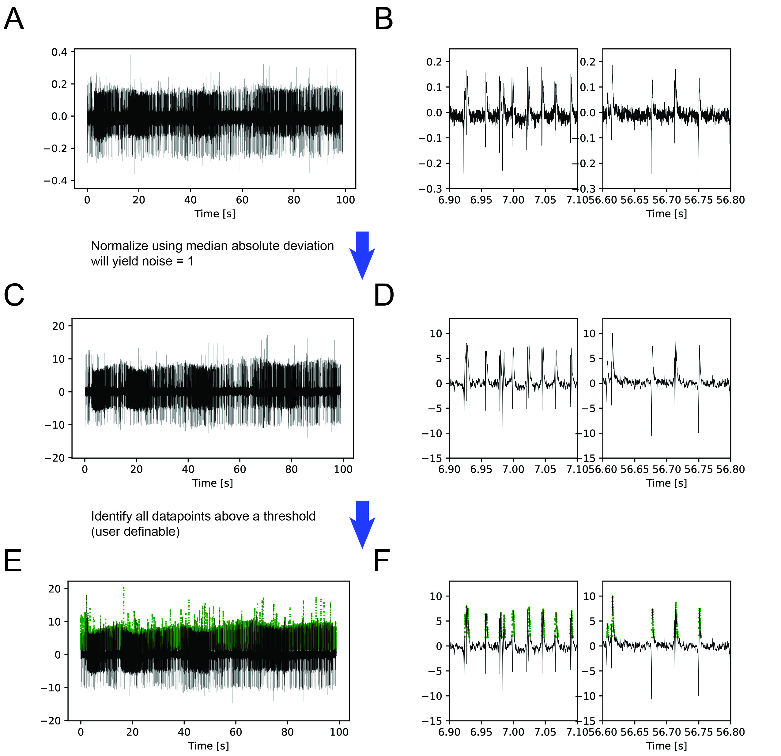
Figure 1: (A) Raw example trace over 100 seconds. (B) Detailed view of 200 ms of the raw trace at two different times. (C) Raw data is first normalized using the median absolute deviation so that the noise of the data becomes 1. Next, data is filtered using a FIR 400 - 4000 bandpass filter. (D) Detailed view of filtered data. (E) User defined threshold above which a ‘peak’ is defined as a potential spike of interest.
For all consecutive datapoints the peak is defined and 3 milliseconds before and after are defined to be a single waveform (Figure 2A). Individual features are extracted from each waveform, such as the amplitude peak (Figure 2B) and a summary vector is constructed for each waveform (Figure 2C).
These summary vectors are first dimensionality reduced using UAMP and then clustered using the HDBSCAN clustering algorithm (Figure 2D). It is possible to influence cluster size with the ‘epsilon’ parameter. To allow the user to visually identify the clusters of interest, they are plotted on the electrophysiology trace (Figure 2E/F). In this example, the spikes of interest have a pink peak amplitude preceded by a cyan ‘minipeak’. Selecting the pink group is sufficient to catch the spikes of interest.
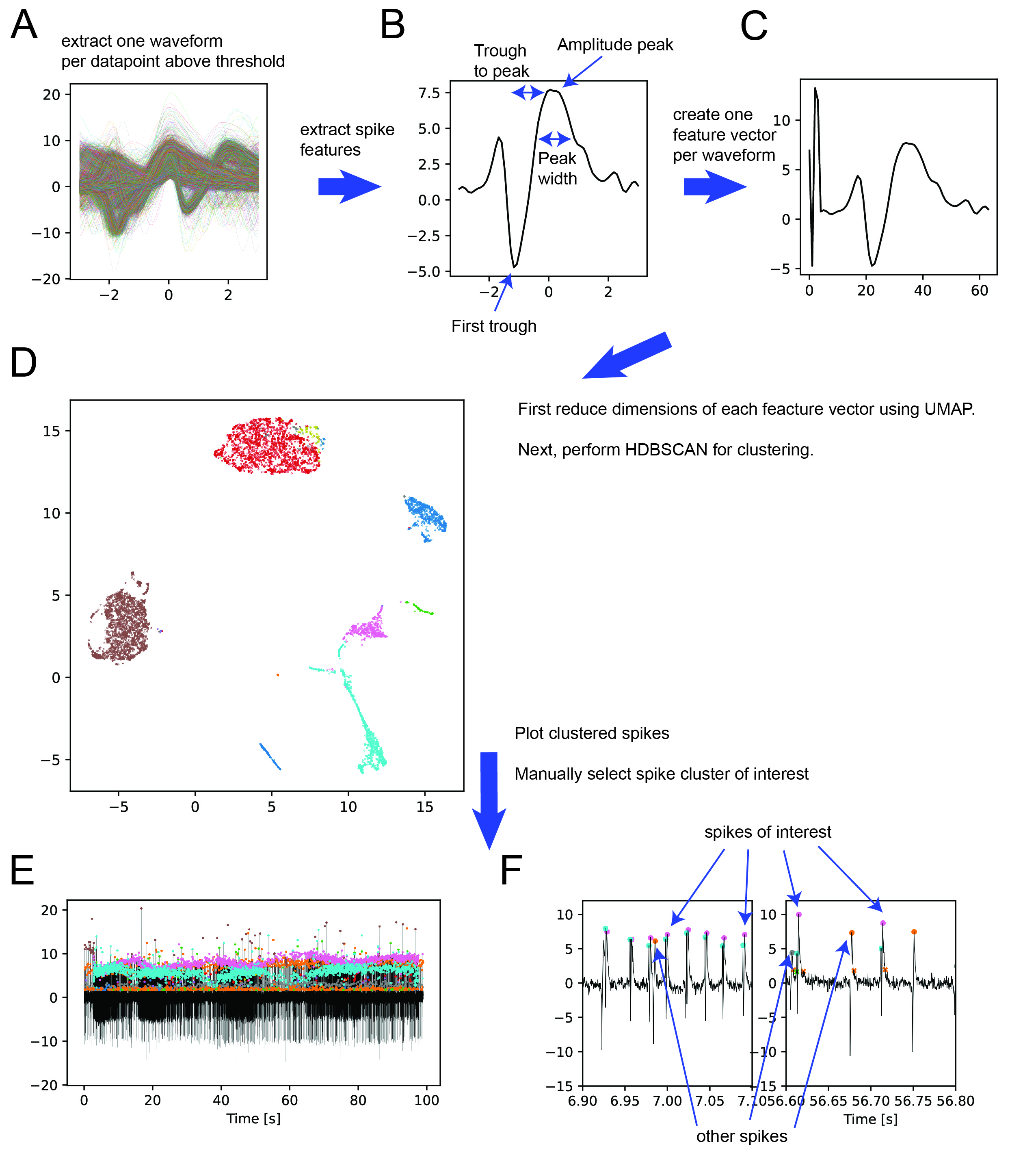
Figure 2: (A) Find peak of each consecutive datapoint above threshold and extract 3 ms before and after. (B) Extract spike features, for example amplitude peak. In addition to the features shown in the figure it is possible to extract: (1) second trough amplitude, (2) Peak to first trough, (3) Peak to second trough, (4) rise slope, (5) fall slope, (6) area under curve (AUC) first trough, (7) AUC second trough, (8) AUC peak, (9) energy, (10) minipeak, (11) previous troughs. (C) Use extracted features to create a feature vector. User can define which features to add. (D) Run clustering using HDBSCAN algorithm on UMAP dimensionality reduced feature vectors. User can influence cluster size with epsilon. (E) Plot clusters on electrophysiology trace. (F) detailed view, indicating for this example the spikes of interest (pink) and other spikes (orange, grey). Recordings often contain ‘double bumps’ in the neuron of interest as has been described before (Schulze et al., 2015)
Finally, it is possible to correct any mistakes the spike sorter might have made using a graphical user interface (GUI) (Figure 3A). The GUI allows one to quickly zoom into a region of interest and compare spikes from distant regions of the recording. It is also possible to compare a spike of interest to the mean spike waveform of all currently defined spikes of interest. The final output of the spike sorter is shown in Figure 3B, where the spikes of interest are plotted as a raster plot. In this example, every time the odor stimulus increases (yellow trace, bottom plot) more spikes are observed whereas less spikes are observed if the odor stimulus decreases as has been described before (Schulze et al., 2015).
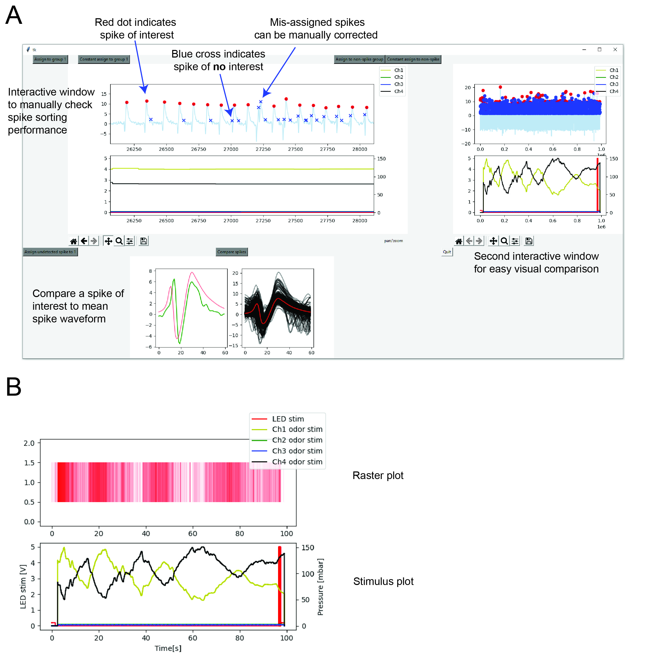
Figure 3: (A) After selecting cluster(s) of interest it is possible to manually correct mis-assigned spikes using a graphical user interface. (B) Resulting raster plot (red, top plot) in response to odor (yellow trace, bottom plot). Black trace in bottom plot is saline (no stimulus) and red indicates a red light optogentic stimulus.
The spike sorter is available here.